ITTEN

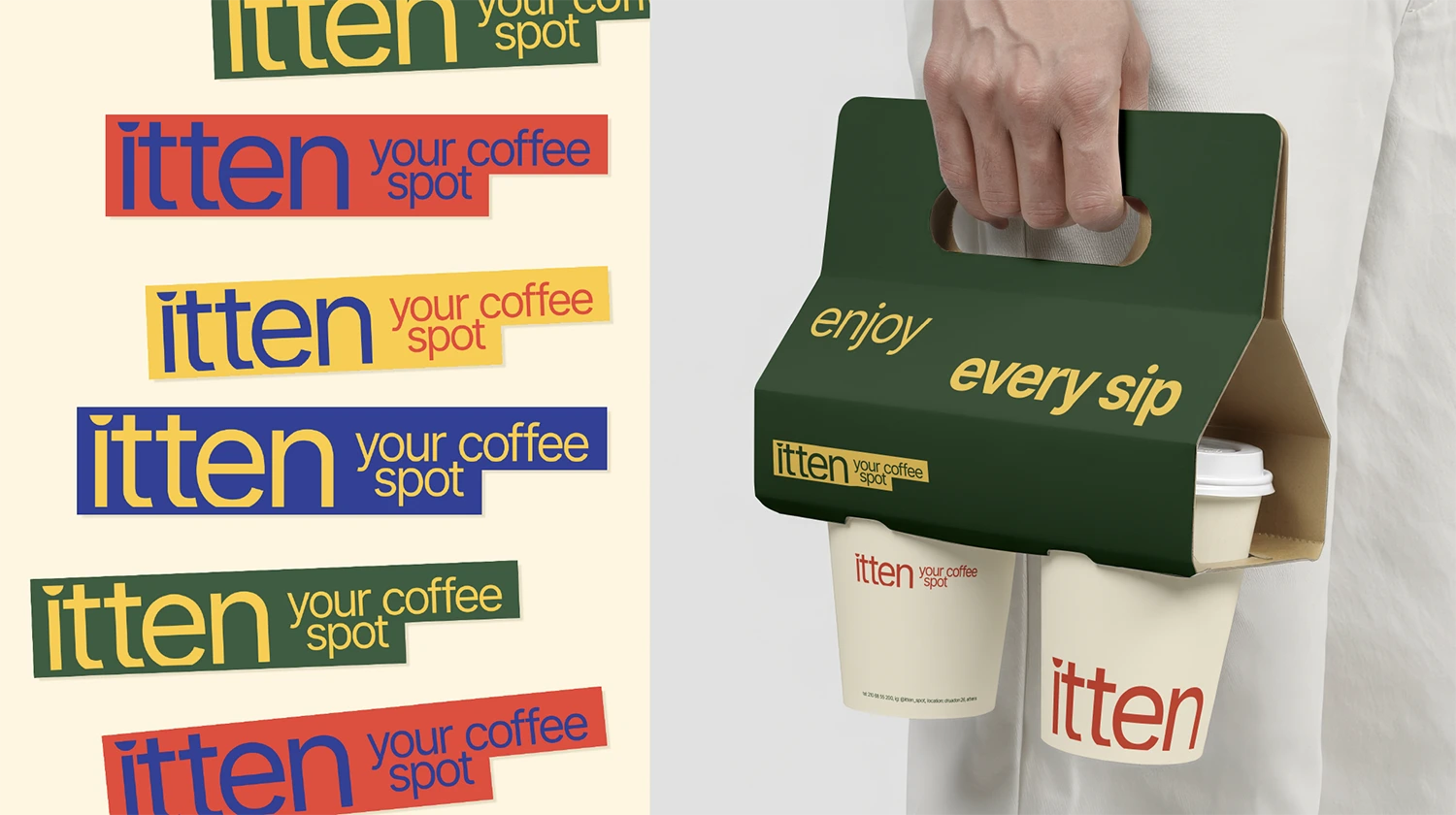
For itten, a concept coffee spot dedicated to study and concentration, we designed an identity that balances aesthetics and the functionality of the everyday experience.
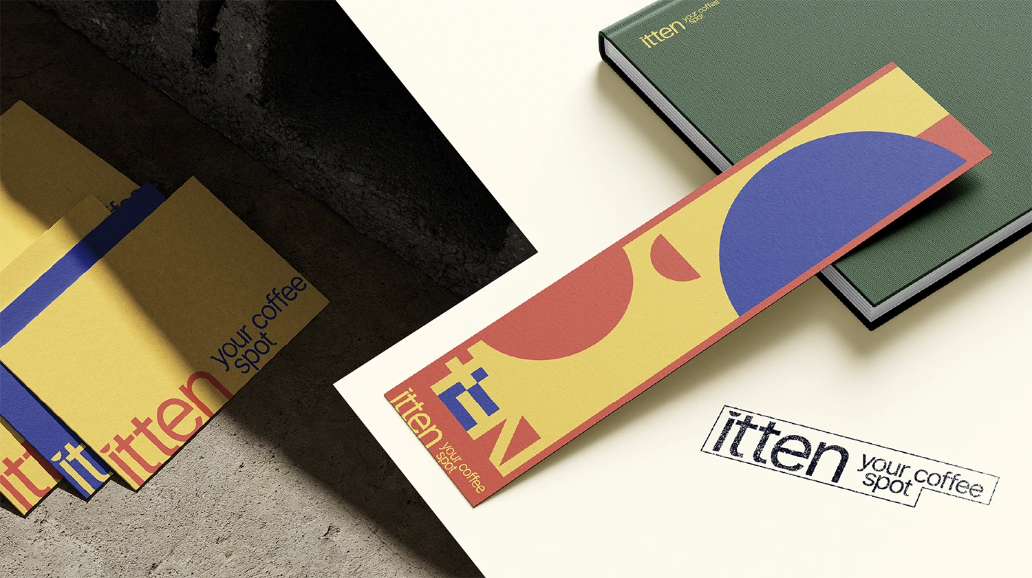
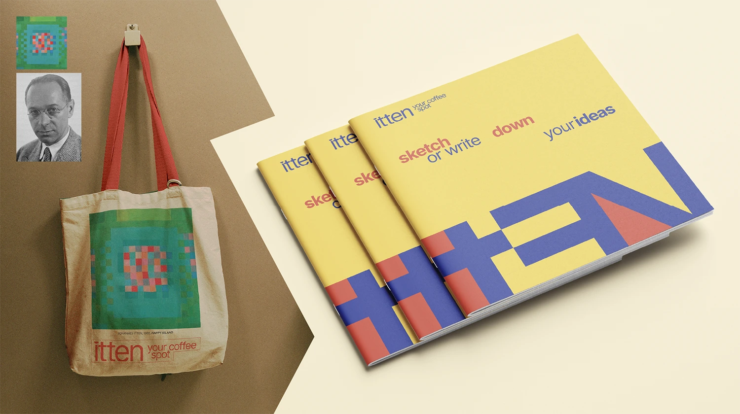
The creative direction was based on the principles of Bauhaus, with clean forms, geometry and bold colors. We created a comprehensive corporate identity that is consistently applied to every point of contact with the consumer, from the signage of the space to the packaging and publications.
The result is a modern brand that combines minimalism, inspiration and functionality, highlighting the creative process in the company of our favorite beverage.
Coffee Spot
Germany
Project Preview

- Logo design and integrated brand identity inspired by the Bauhaus philosophy
- Branding applications in signage, packaging, glasses, printed matter and promotional materials
- A coherent and functional system that enhances user experience and brand awareness
BECOME OUR NEXT MILESTONE


Say hello to us
Contact the Webeleven team to see your business evolve in the digital world.
Get a reply fast, typically within 30 minutes!