KORYO

We undertook the creation of the new corporate identity for Koryo Tae Kwon Do, a school that represents the discipline, strength and philosophy of Taekwondo.
We started from a blank canvas, designing a handwritten and unique logo, which captures the movement, energy and balance of the sport.
The creation was based on a font design and a carefully selected color palette inspired by the Korean flag and the spirit of sports.
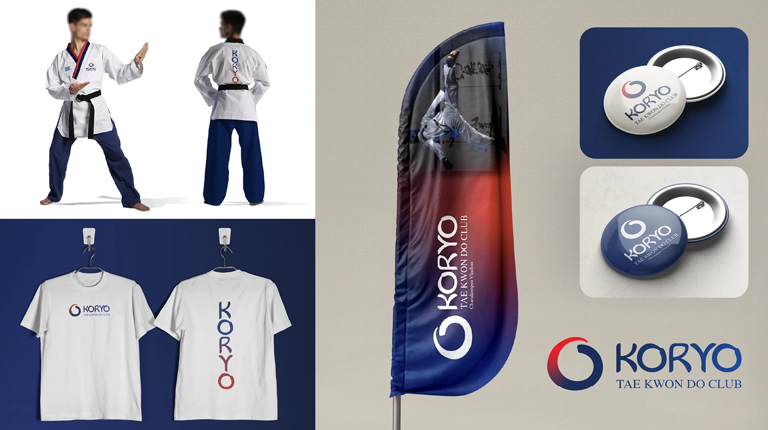
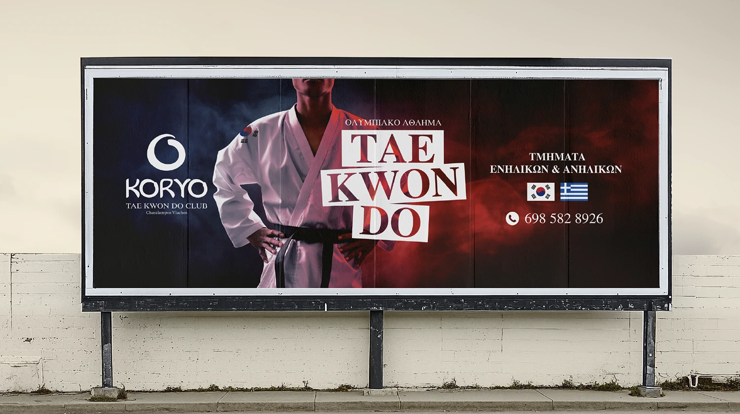
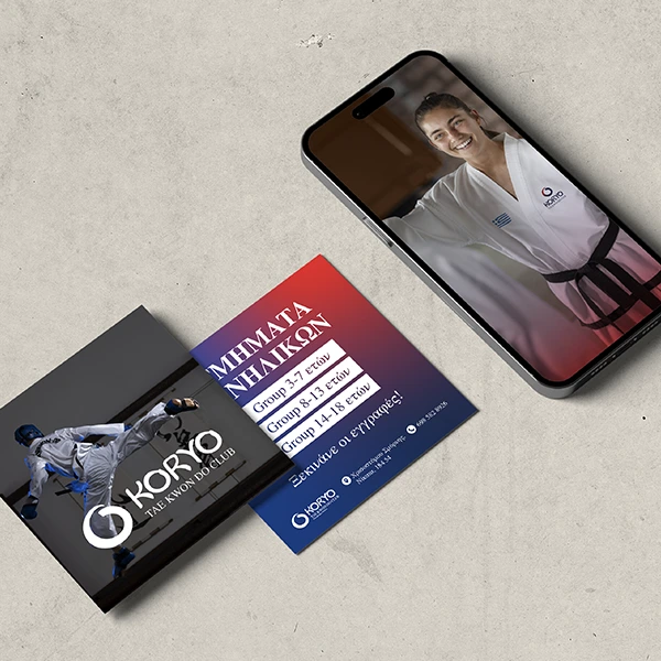
At the same time, we presented a full implementation of the brand through proposals for clothing, banners, badges, printed and digital media, thus offering a complete image of the new identity.
The result is a brand that exudes dynamism, respect for tradition and professionalism.
TAE KWON DO club
Greece
Project Preview
- We designed a unique, handwritten logo that expresses the power and movement of Tae Kwon Do
- We created all possible applications of the brand, from printed matter and banners to clothing and digital uses
- We delivered a complete identity that combines tradition, modern design and functionality for every need of the school
BECOME OUR NEXT MILESTONE


Say hello to us
Contact the Webeleven team to see your business evolve in the digital world.
Get a reply fast, typically within 30 minutes!